Sometimes the best way is deliver helpful information is to stick it right in front of users’ faces (gently, of course). If the first charge of an electronics product is vitally important for battery life, stick a sticker on the battery contacts saying so. If online help is needed to explain functionality, maybe some of that work can be done using well-chosen field names and grouping related controls. The more “documentation” can be gently integrated into the product itself, the more likely it is that users will take to the product and learn to use it properly.
Now if I say “embedded user assistance”, a kids’ card game is probably not what comes to mind.
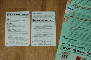
The designers of Monopoly Deal have struck a nice balance in how they deliver the help to players. The instructions look like this:
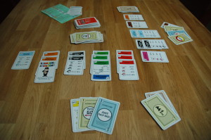
The green sheet is the rules. It’s not long, and the designers have reused basic concepts from traditional Monopoly, such as collecting money and property, charging rent and adding houses and hotels. Their Quick Start Rules card is a two-sided recap of the rules, but you could use it to just get going without referring to the green sheet. The most important rules are distilled down to that single card, and the players are invited to just start playing and all will become clear. All does become clear because the designers have embedded some extra help in the game:

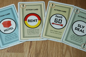
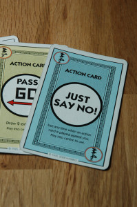
Instructions for using action cards are provided on the cards themselves. No back and forth between game parts and the rules.
These are “action” cards, probably the aspect of the card game that deviates the most from the board game. What makes this easier to grasp is that the instructions for using each action card are printed on the card. Players don’t have to resort to the green rules sheet trying to remember what their action cards do, it’s right there on the card:
Documentation has no value if the user never sees it. If it’s possible to get the documentation integrated with the product itself, then do it. The user is guaranteed to see it as they go about their tasks. They’ll get more out of using the product without even noticing they’re using the help.


